
A Non-Phone Friendly Site IS Hurting Your Business
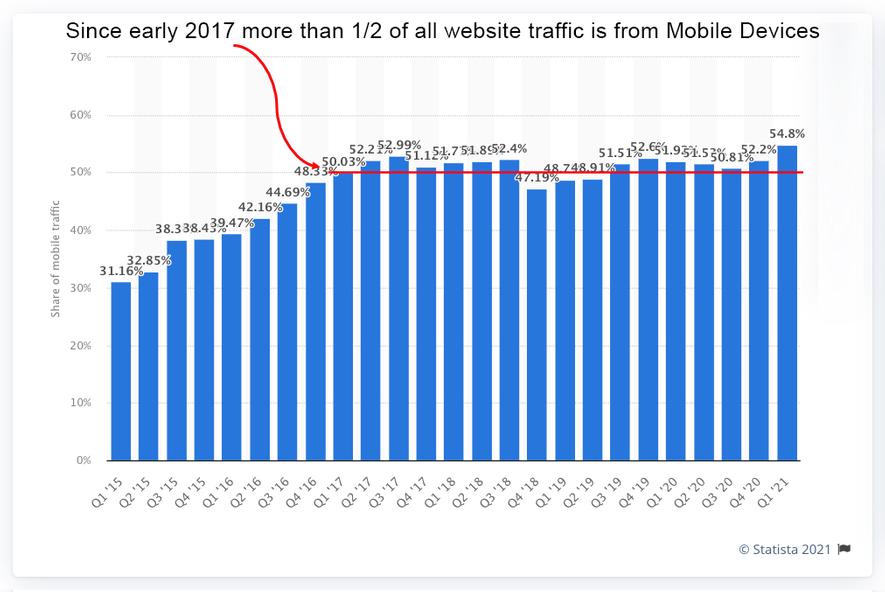
Over 50% of all web traffic is from Mobile Devices
Since early 2017, more than 50% of all website traffic is from mobile devices. If your site is not a responsive design, phone-friendly it is much more difficult to use for your customers and it is hurting your search results.
Obviously using a phone for both personal and professional reasons is not only here to stay, but will continue to increase. Unfortunately, some 'old school' business owners project their negative feelings about both online ordering and using a phone to get online to their customers and are very reluctant to invest in a responsive website let alone one with online ordering.
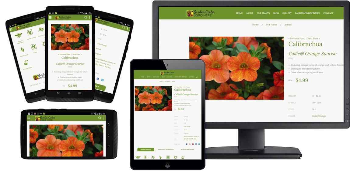
For the last 5+ years, every website we have built for wholesale growers has been responsive (the site adjusts automatically to display properly on computer monitors, tablets, and smartphones) and all but a handful have had online ordering for their wholesale customers.
Responsive Website Benefits
Ease of Use
A responsive website automatically adjusts the display to look good on the specific device your customer is using to access your site.
Therefore it is much easier for users with mobile devices to use your site. If your competitors have a responsive site design and you don't, which website do you think your customers will use when they're sitting in their truck waiting for a storm to pass or sitting in the bleachers waiting for their kid's game to start? For the most part, they will use the site that is easiest to use from their phone.
Improve Search Results
In addition to improved customer service, a responsive site will improve your search results. Search engines like Google and Yahoo strive to deliver the most useful search results for their users. Therefore when a user initiates a search from their mobile device, Google and other major search engines prioritize displaying responsive websites over non-responsive sites assuming the content on both sites is relatively equal.
Ready to Upgrade?
If you would like to chat about the benefits of upgrading your site, please schedule a free consultation.

Non-Responsive websites 'squeeze' the content into the smaller screen sizes whereas Responsive Sites adjust the content automatically to be easily viewed on smaller screens.
Latest Posts

Latest Posts
-
July 16, 2025Timothy Howard
-
June 19, 2025Timothy Howard
-
April 25, 2025Glenda Howard